top of page

Launching a B2B Pension product for a.s.r. verzekeringen
With my company Yellowtail BV.
Project Goal
Designing a new product that will allow employers and business owners to get information, do calculations, speak to experts, and eventually convert to this pension product.
My role
Designing tools, information pages, and aiming for conversion. As the only designer in this project, I have worked together with multiple teams. Since this product was acquired from Brand New Day by a.s.r., that meant many integrations and alignments between two companies.
Team
Me (UX Designer), Business analysts, Product Owner, FE Developers, BE developers, many other business stakeholders from a.s.r.

🎯 The challenge and the goal
a.s.r. verzekeringen acquired a new product, aimed specifically for small business owners. This is acquired from Brand New Day, and would be now called Doenpensioen. The challenge is, a.s.r. had many other pension products, but this product had to be introduced into it's product catalogue. Also, it is a brand new product with a new name, that many potential clients do not know about. This means they also do not know what the product offers, and how much it costs.
Therefore my goal was:
-
Designing information pages that employers can read and learn more about the product,
-
Designing calculation tools that give employers a good estimation of costs of this product,
-
Designing tools and pages to enable employers to speak to a financial expert anytime, so they can get information and become a client if they decide to,
-
Overall, the goal is to converting the visitors into clients of this product.
✍️ Approach
Here is a short explanation of how we approached the problem, and how our process looked like.

We aim to understand the user together with business to see what they want to achieve via this dashboard.
🧑Understand the user
User Persona
We created user persona together with the insight from business. This entailed analysing small business owners, namely the decision makers from start ups and scale ups.
How can we best meet users needs? We brainstorm, ideate solutions, and define how are going to execute it.
💡 Ideate & Define
Ideation
I conducted multiple sessions to lay out designs of our tools and content, together with my ideas of how these would best convert these users into clients.
Time to make it into something real. Collaborating extensively with developers for feasibility and consistency.
🚀 Execute
Aligning with developers
I have done sessions with developers to look at the designs I have. Which components need tweaking? Anything does not exist in style guide?
Data Analysis
I have worked together with financial consultants and marketing/data specialists to understand which are the main routes to convert these users into clients of this product.
Wireframing
I have designed wireframes to further visually illustrate to non-design background stakeholders how my ideas would look like.
Handoff
Handing off the components/screens to developers to they can start with building. Used Zeplin in this case.
User Flow & Information Architecture
We mapped out user flows to analyse where and how the users would arrive to this product. We carefully positioned the new product into the website via analysing the whole of the website.
Prototyping & UI design
I created desktop and mobile prototypes using the brand style guide/design system and shared this demo with stakeholders.
User tests
We have conducted 5 usability tests with potential clients to analyse the product before it went live. We took one month to re-design and re-develop it before going live!
🙋♂️ What users needed, what I have designed.
Designed a landing page that gives information to the users, with multiple CTA's that directs users into our main conversion items: Calculation tool, and phone appointment with a financial expert. Users can also go to blogs from here or read more about what the product covers.
👋 A landing page of our new product.


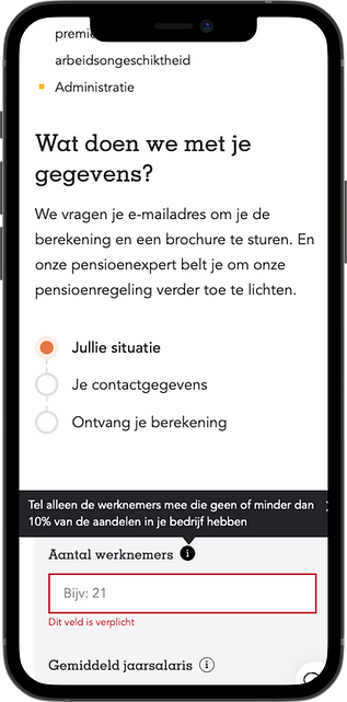
I designed a calculation tool that allows potential clients to calculate the cost estimation in a few seconds. I have divided this calculation into multiple steps, used visual cues and a progress bar to keep users in the process.
We have conducted multiple A/B tests on this page to analyse the conversion of this tool. With the insight we:
-
Played with copy,
-
Decreased the number of input fields at the last step,
-
And added a information section about how we are using the personal information,
-
Added more tooltips,
🧮 Calculation tool


In the research phase we analyzed that our users have flexible schedules. And finance experts/customer support is not always available from the product. Therefore we decided to make a tool where users can create appointments to talk to the finance experts and get information when it works for them. So we created this call appointment tool.
☎️ Talk to an expert when you want to!

I have designed many more content pages that is visible in the website. I have worked together with many other product stakeholders to position this new product into the big catalogue of a.s.r.
I worked together with the UX researchers to arrange a usability test, and used the insights to improve the designs before going live.
I also worked closely with our data analyst to conduct multiple A/B tests, and with this insight, edited many things that helped increase the conversion.
A/B tests, Usability test, and many other designs...
🕺 The end.
This product just went live in April 2022.
-
It was a huge learning and growth opportunity for me since I worked with too many stakeholders from two different companies: that means working with a lot of feedback, and stakeholder management.
-
Multiple tests (including usability and A/B tests) we conducted helped enable to improve our product and do less assumptions.
I really enjoyed designing this product as it enabled me to increase my skills in user research!
bottom of page